Image

Denver Zoo

The Denver Zoo's website was in need of a redesign to improve its digital experience and better engage its visitors. The goal was to create a more intuitive and personalized experience for users by incorporating user research and a design system. The project scope included redesigning the website's layout, navigation, and content, as well as improving accessibility.

Image
Challenge

The primary challenge was to redesign the website to make it more user-friendly and provide visitors with a seamless online experience. The project also aimed to address issues related to the site’s information architecture, content, and navigation..

Scope of work

Design System, User Research, User Interface Design for Website

Timeline

12 Weeks

Tools

Figma, UX Metrics


Prototype Link

Link


My Role

As UX designer, My responsibilities included:
- Conducting user research
- Conducting a complete UX Evalutation.
- Prototyping our solutions
- Validating designs with user testing
- Card Sorting and Tree Testing using UX Metrix to define and validate the Information Architecture of the website.

Research

I started conducting the user research with the UX Evaluation, After which i conducted card sorting, Tree testing and Usabinglity testi

Image
UX Evaluation

For this project, I conducted a comprehensive UX evaluation of the Denver Zoo's existing website to identify problems and opportunities for improvement. The evaluation covered multiple aspects of the user experience, including usability, findability, visual design, and content evaluation.

Usability Evaluation:
Usability evaluation involved analyzing the navigation and information architecture, task orientation, help, feedback and error tolerance, accessibility, and technical design, as well as forms and data entry on the website. I identified several issues such as unclear labeling, difficult navigation, and a lack of help and feedback options.

Findability Evaluation:
The findability evaluation focused on assessing how easily users could find the information they were looking for. I evaluated searching, results set, and content findability. My findings highlighted several issues, such as irrelevant search results and a lack of meaningful content.


Visual Design Evaluation:
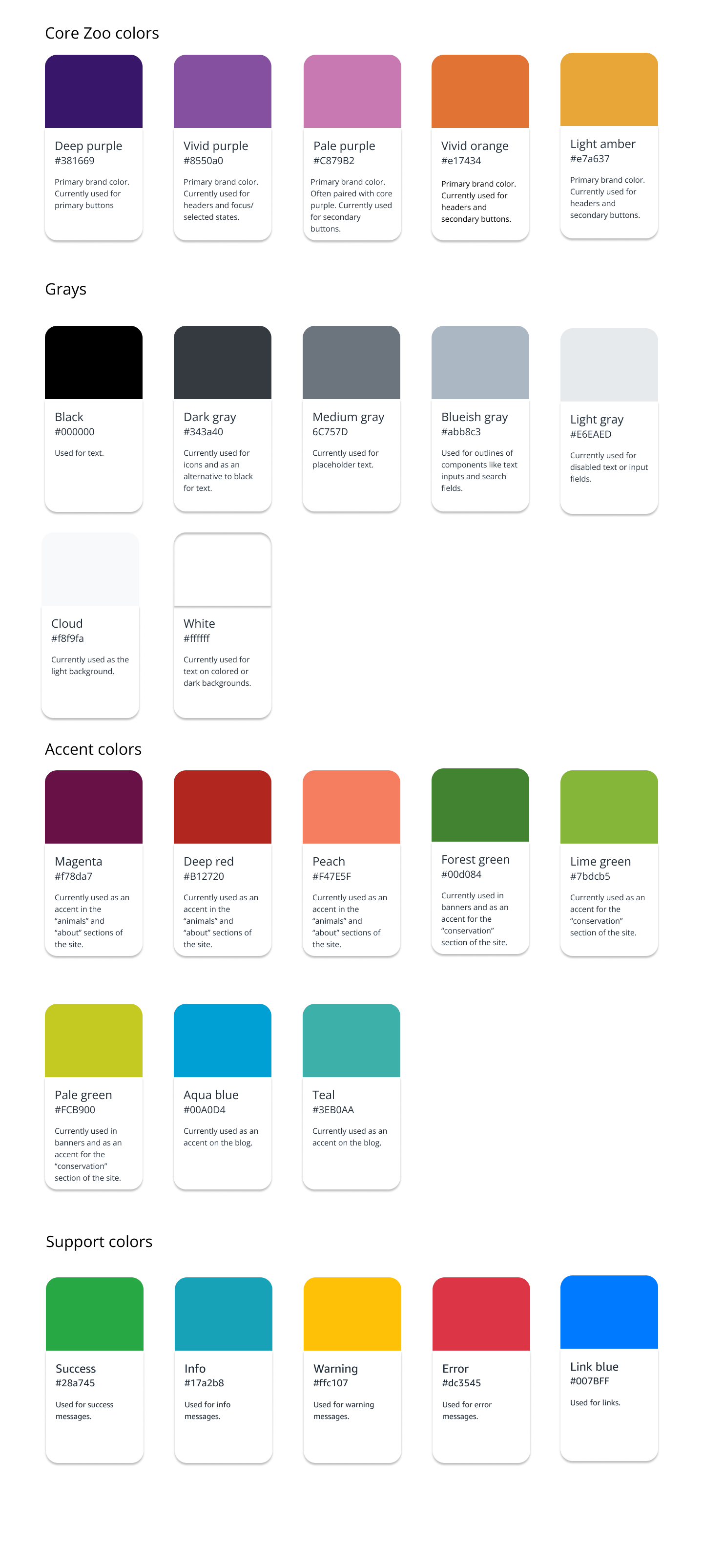
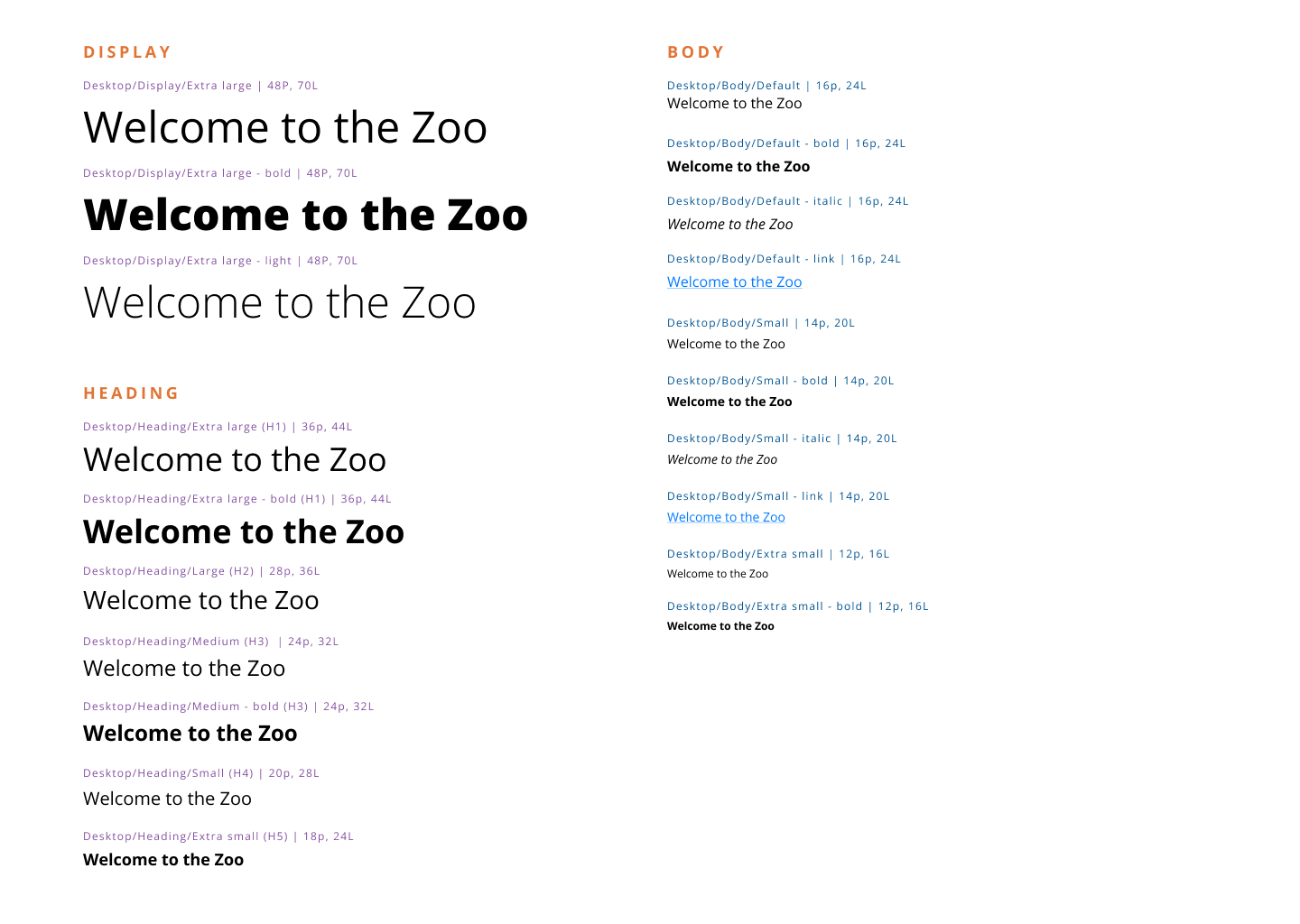
The visual design evaluation involved reviewing the content and layout, color, font and typography, imagery and iconography, on-screen components, data visualization, animation and interaction, brand identity, and overall visual hierarchy of the website. My analysis revealed several design inconsistencies and areas for improvement, such as poor use of contrast and font choices.


Content Evaluation:
Lastly, the content evaluation involved assessing the quality and relevance of the website's content, including meaningful content, technical writing, and trust and credibility. I identified several areas where the content needed to be improved to better meet users' needs.

Overall, the UX evaluation identified several issues that needed to be addressed to improve the Denver Zoo website's user experience. The evaluation helped guide the subsequent redesign efforts to ensure that the new design addressed the problems and improved the overall user experience.

I have included some images and document from my evaluation below:


1. UX Evaluation Spreadsheet

2. Evaluation and opportunities presentation

  • Image


    Card Sort:

    ● Conducted an open card sort with 15 participants to understand how users categorize and prioritize information on the website. ● Identified key categories such as Tickets & Membership, Visit Planning, Animals & Exhibits, and Events & Programs.

  • Image


    Site Map:

    ● Created a site map to visualize the existing website structure and identify areas for improvement. ● Reorganized the navigation to simplify the user journey and highlight key content. ● Image: Site map diagram .

  • Image
  • Image


    Tree Test:

    ● Conducted a tree test to evaluate the effectiveness of the new navigation structure. ● Found that users were able to complete tasks more quickly and with fewer errors. ● Surprisingly, users preferred a different navigation label for the "Animals & Exhibits" section than originally proposed.
    Below is a report on the Tree test results .


    1. Tree test results

  • Image

Usability Testing

Summary

The user testing was focused on evaluating the Denver Zoo website's prototype. Overall, the feedback indicates that the website is generally easy to use, and the user did not find any major issues or missing information on most pages. However, there are some areas for improvement, such as clarifying how many hours a ticket is valid for, navigation during the ticketing process, and making certain information more prominent on the homepage.

The user was drawn to the banner image at the zoo website and upcoming events on the homepage. They also checked the daily schedule to see if something was interesting. The user found the Contact Us page to be clear and useful for contacting the zoo, but suggested that the many subjects could be organized better with a dropdown.

Regarding the purchase flow, the user found the Search Tickets page easy to understand, with the date and time displayed along with the visitor details. However, the participant was not understanding how many hours they can spend at the zoo based on their ticket and suggested that the timings could be made more prominent. The participant found the Buy now page to display additional amenities for purchase, such as food, and the Login page to be clear and not missing any information. The Order Review Page was found to be communicating a review of the order, delivery method, and extra items, along with pricing details. However, the participant found the "Avoid cancellation" text confusing, also what everyone expected after “Pay now” was really confusing and not as expected by the user.

Scenarios

Scenarios that participants were asked to go through

Usability Testing Notes

  • Image
Proposed solutions based on participant's feedback

-Clarifying how long a ticket is valid for and making this information more visible on the Search Tickets page.
-Making certain information, such as the location and hours of operation, more prominent on the homepage.
-Organizing the many subjects on the Contact Us page better with a dropdown to make it easier to find information.
-Adding information about sold-out dates or unavailable tickets to the Search Tickets page.
-Displaying a breakdown of ticket prices by age group on the buy tickets process.
-Clarifying that tickets will be sent to the email address if continuing as a guest on the Login page.
-Making the "Avoid cancellation" text on the Order Review Page more clear and informative.
-Rephrasing “pay now” from each page to “Proceed with payment” or “Review Order” “place order” would make the user feel confident about what will happen next

Overall, the user testing feedback suggests that the Denver Zoo's prototype has some areas for improvement, but the prototype is generally easy to use. By implementing the suggested improvements, the prototype can become more user-friendly and enhance the user experience of the visitors.

Design System Pattern Audit & Design System

In the design system patterns audit, we analyzed the current design system of the Denver Zoo website, identifying common design patterns and inconsistencies that needed to be addressed in the redesign. We also created a Design system to keep our fonts, colors, icons and patterns consistent across the website

Image
  • Image
  • Image
  • Image
  • And alot more :D
    Grids, Patterns and Iconography etc.


Lo-fi Design and Hi-fi Design

During the design phase, annotated low-fidelity wireframes were created using Figma, to visually communicate the layout, content, and functionality of the redesigned Denver Zoo website. The annotations helped to explain the design decisions and provided context for future design iterations.

For annotated high fidelity wireframes, I created a set of fully designed screens for the key user flows that incorporated feedback from the low fidelity wireframes. I added annotations to provide clarity and detail about the intended functionality and interactions, as well as design decisions and reasoning behind them. These annotated wireframes helped to refine the design and provided a clear blueprint for the high fidelity prototype.

  • Image
  • You can checkout the prototype here

Reflection

The Denver Zoo redesign project taught me the importance of thorough research and iteration in creating a successful user-centered design.

Future plans

Moving forward, I would recommend conducting more user testing to validate the changes made during the redesign. Additionally, I would continue to iterate on the design based on user feedback and analytics data. With more time, I would also suggest expanding the redesign to include more areas of the website such as the online gift shop and the zoo's conservation initiatives.


Conclusion

Through this project, I learned the importance of thorough research and testing in the UX design process. I also discovered the value of creating a comprehensive design system to maintain consistency and improve efficiency in the design process. Overall, the redesign of the Denver Zoo website aimed to enhance user experience and increase engagement, and I believe that the implemented changes have successfully achieved these goals.


Instructor Feedback

Design feedback on both low and high fidelity wireframes primarily focused on using a grid system to align items, ensuring consistency in font and color accessibility, and checking for WCG compliance. Additional feedback was received on making content changes to certain buttons, improving the readability of the footer by removing pattern backgrounds, and simplifying the contact page.

Changes were made to address these feedback points, including implementing a grid system, using consistent fonts and colors, modifying content on buttons, removing the pattern background from the footer, and streamlining the contact page.